Turning Data into Stories: The Art of Data Storytelling
Week 2, Day 4: Data Storytelling
Welcome to Day 4 of Week 2: Advanced Analytics and Visualization! Today, we’re shifting our focus from technical skills to the art of data storytelling. Data storytelling is the process of using data, visuals, and narrative to communicate insights effectively. Whether you’re presenting to stakeholders, writing a report, or creating a dashboard, storytelling transforms raw data into compelling, actionable stories. Let’s dive in and learn how to make your data unforgettable!
Why Data Storytelling Matters
Data storytelling bridges the gap between analysis and action by:
Engaging Your Audience: Captivate stakeholders with clear, relatable stories.
Simplifying Complexity: Make complex data easy to understand.
Driving Decisions: Inspire action with data-backed insights.
Without storytelling, even the most insightful analysis can fall flat.
Topics Covered
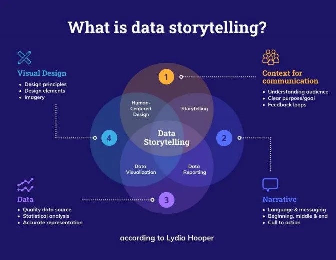
1. What is Data Storytelling?
Data storytelling combines data, visuals, and narrative to communicate insights effectively.
Key Elements
Data: Accurate, relevant, and well-prepared data.
Visuals: Charts, graphs, and dashboards that highlight key insights.
Narrative: A clear, compelling story that ties everything together.
Real-World Example:
A retail company uses data storytelling to explain why sales dropped in Q4 and propose a strategy for recovery.
2. Crafting a Data Story
Step 1: Know Your Audience
Who are they? Executives, analysts, or the general public?
What do they care about? Revenue, customer satisfaction, or operational efficiency?
What action do you want them to take? Approve a budget, change a strategy, or explore further?
Step 2: Define the Problem
Start with a clear question or problem (e.g., “Why did sales drop last quarter?”).
Use data to provide context and set the stage.
Step 3: Present the Data
Use visuals to highlight key insights (e.g., line charts for trends, bar charts for comparisons).
Keep visuals simple and focused.
Step 4: Tell the Story
Structure your story with a beginning, middle, and end:
Beginning: Set the context and define the problem.
Middle: Present the data and insights.
End: Propose a solution or call to action.
Example:
Beginning: “Sales dropped by 15% in Q4 compared to Q3.”
Middle: “Our analysis shows that the drop was driven by reduced marketing spend and seasonal trends.”
End: “We recommend increasing marketing spend in Q1 and launching a seasonal promotion.”
3. Tools for Data Storytelling
PowerPoint
Create slides with a mix of visuals and narrative.
Use templates to maintain a consistent style.
Example:
Slide 1: Problem statement.
Slide 2: Key insights (charts and graphs).
Slide 3: Recommendations.
Canva
Design visually appealing presentations and infographics.
Use pre-built templates for quick, professional results.
Example:
Create an infographic summarizing sales trends.
Flourish
Build interactive charts and maps for web-based storytelling.
Embed visuals in blogs, reports, or dashboards.
Example:
Create an animated bar chart race showing sales growth by region over time.
4. Best Practices for Data Storytelling
Keep It Simple: Focus on the most important insights.
Use Visuals Wisely: Choose the right chart for the data (e.g., bar charts for comparisons, line charts for trends).
Tell a Story: Use a narrative structure to guide your audience.
Be Honest: Don’t manipulate data to fit your story.
Pro Tip: Use the “So What?” Test
After presenting an insight, ask yourself, “So what?” If the insight doesn’t lead to a clear action or conclusion, it may not belong in your story.
Example:
Insight: “Sales increased by 10% last quarter.”
So What?: “This growth was driven by a successful marketing campaign, so we should allocate more budget to similar campaigns.”
Practice Tasks
Task 1: Create a Data Story
Choose a dataset (e.g., sales, customer feedback).
Identify a key insight or trend.
Create a presentation (PowerPoint, Canva) that tells the story.
Task 2: Build an Interactive Visual
Use Flourish to create an interactive chart or map.
Embed it in a blog post or report.
Task 3: Present to a Friend or Colleague
Share your data story with someone unfamiliar with the data.
Ask for feedback on clarity and impact.
Key Takeaways
Data Storytelling: Combines data, visuals, and narrative to communicate insights.
Crafting a Story: Know your audience, define the problem, present the data, and propose a solution.
Tools: Use PowerPoint, Canva, and Flourish to create compelling stories.
Best Practices: Keep it simple, use visuals wisely, and be honest.