From Data to Dashboards: Mastering Business Intelligence Tools
Week 2, Day 2: Business Intelligence Tools
Welcome to Day 2 of Week 2: Advanced Analytics and Visualization! Today, we’re diving into the world of Business Intelligence (BI) tools, which empower organizations to turn raw data into interactive, actionable dashboards. Whether you’re analyzing sales trends, tracking KPIs, or presenting insights to stakeholders, BI tools like Power BI and Tableau are essential for modern data professionals. Let’s explore how to create stunning visualizations and dashboards that drive decision-making!
Why Business Intelligence Tools Matter
BI tools help you:
Visualize Data: Create interactive charts, graphs, and maps.
Monitor Performance: Track key metrics and KPIs in real time.
Share Insights: Collaborate with teams and stakeholders.
Make Data-Driven Decisions: Turn insights into action.
Topics Covered
1. What are Business Intelligence Tools?
BI tools are software applications that enable users to analyze, visualize, and share data. They connect to various data sources (e.g., databases, spreadsheets, APIs) and provide intuitive interfaces for creating dashboards and reports.
Popular BI Tools:
Power BI: A Microsoft tool for creating interactive dashboards.
Tableau: A leading platform for data visualization and analytics.
Looker: A modern BI tool with strong data modeling capabilities.
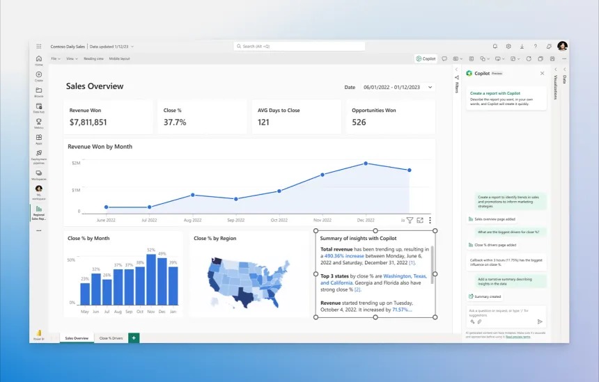
2. Getting Started with Power BI
Power BI is a powerful, user-friendly tool for creating dashboards and reports.
Step 1: Connect to Data
Open Power BI Desktop.
Click Get Data and choose your data source (e.g., Excel, SQL Server, Web API).
Load the data into Power BI.
Step 2: Create Visualizations
Drag and drop fields onto the canvas to create charts, tables, and maps.
Customize visuals using the Format pane.
Example:
Create a bar chart showing sales by product category.
Add a slicer to filter data by region.
Step 3: Build a Dashboard
Combine multiple visuals into a single dashboard.
Add interactive elements like filters and drill-throughs.
Example:
Build a sales dashboard with metrics like total revenue, profit, and top-selling products.
Step 4: Share and Collaborate
Publish your dashboard to the Power BI Service.
Share it with your team or stakeholders.
3. Getting Started with Tableau
Tableau is known for its intuitive interface and powerful visualization capabilities.
Step 1: Connect to Data
Open Tableau Desktop.
Connect to your data source (e.g., Excel, SQL, Google Sheets).
Step 2: Create Visualizations
Drag fields onto the Rows and Columns shelves to create charts.
Use the Marks card to customize colors, labels, and tooltips.
Example:
Create a map showing sales by region.
Add a trend line to analyze sales over time.
Step 3: Build a Dashboard
Combine multiple sheets into a dashboard.
Add filters, parameters, and actions for interactivity.
Example:
Build a dashboard with a map, bar chart, and summary table.
Step 4: Share and Collaborate
Publish your dashboard to Tableau Server or Tableau Public.
Share it with your team or embed it in a website.
4. Choosing the Right BI Tool
| Feature | Power BI | Tableau |
|---|---|---|
| Ease of Use | Beginner-friendly | Steeper learning curve |
| Cost | Affordable (included in Microsoft 365) | Expensive |
| Integration | Seamless with Microsoft products | Works with many data sources |
| Visualization | Good for standard business visuals | Superior for complex visualizations |
When to Use Which?
Power BI: For organizations already using Microsoft tools.
Tableau: For advanced visualizations and flexibility.
Pro Tip: Automate Dashboards with Scheduled Refreshes
Both Power BI and Tableau allow you to schedule data refreshes, ensuring your dashboards always show the latest data.
Example:
In Power BI, set up a scheduled refresh in the Power BI Service.
In Tableau, configure an extract refresh on Tableau Server.
Practice Tasks
Task 1: Create a Sales Dashboard in Power BI
Connect to a sales dataset (e.g., Excel or SQL).
Create visuals like bar charts, maps, and KPIs.
Publish and share the dashboard.
Task 2: Build a Regional Analysis Dashboard in Tableau
Connect to a dataset with regional sales data.
Create a map, trend line, and summary table.
Publish and share the dashboard.
Task 3: Compare Power BI and Tableau
Build the same dashboard in both tools.
Compare ease of use, visualization options, and performance.
Key Takeaways
BI Tools: Power BI and Tableau are essential for data visualization and analytics.
Dashboards: Combine visuals, filters, and interactivity for impactful insights.
Sharing: Publish and collaborate on dashboards with your team.
Automation: Schedule data refreshes to keep dashboards up to date.